Chapter 6 Linear regression in R
Most of the statistical tests in accounting and finance are some
variation on a linear regression. In this section, I am assuming
that you vaguely know what a linear regression is. I am not going
into the mathematical details but I am focusing on the how to
run these tests in R.
6.1 Introduction
There are a number of different ways how we can represent a
linear regression. The first expression shows how the outcome
vector
To esimate the coefficients
reg <- lm(y ~ x1 + x2, data = my_data_set)
summary(reg)
6.2 Linear regression with non-linear theories
Linear regressions can be used with a non-linear theory with some
transformations. The matching theory of CEO compensation implies
that when there are an infinite amount of firms, the relation
between the CEO compensation (
We can see how well the logarithmic transformation works on the simulated data by transformating the scale of Figure 5.4
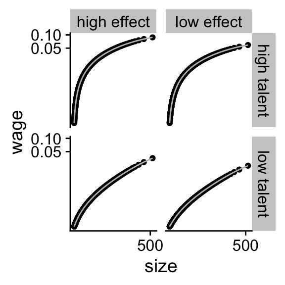 Figure 6.1: The logarithmic transformation of simulated data
plot_exp +
  scale_x_continuous(trans = "log",
                     breaks = scales::pretty_breaks(n = 2))  +
  scale_y_continuous(trans = "log",
                     breaks = scales::pretty_breaks(n = 2))
One reason why it does not work perfectly is that the reservation
wage
Let us now see how well the log transformation works on the real S&P500 compensation data. First, we load the data in.
us_comp <- readRDS("data/us-compensation.RDS") %>%
  rename(total_comp = tdc1)
us_value <- readRDS("data/us-value.RDS") %>%
  rename(year = fyear, market_value = mkvalt)
summary(us_value$market_value)
## Min. 1st Qu. Median Mean 3rd Qu. Max. NA's
## 0.0 880.9 2359.4 12259.8 7836.2 1966078.9 3502We have a bunch of observations with missing values (NA) for
the market value of the firm. I will not further investigate this
but you should definitely do this in your own project.
We combine the market value data with the CEO compensation data
with the left_join function. left_join is a function that
joins two datasets together based on key variables that identify
which observations from one dataset should be matched with which
observations from the other dataset. The join functions in the
tidyverse can be a lifesaver if you are working with multiple
datasets that need to be merged.
us_comp_value <- left_join(select(us_comp, gvkey, year, total_comp),
                          us_value, by = c("year", "gvkey"))
glimpse(us_comp_value)
## Rows: 22,948
## Columns: 5
## $ gvkey <chr> "001004", "001004", "001004", "001004", "001004", "001004…
## $ year <dbl> 2011, 2011, 2012, 2013, 2014, 2015, 2016, 2017, 2018, 201…
## $ total_comp <dbl> 5786.400, 5786.400, 4182.832, 5247.779, 5234.648, 3523.96…
## $ market_value <dbl> 485.2897, 485.2897, 790.0029, 961.3080, 1046.3954, 842.51…
## $ ni <dbl> 67.723, NA, 55.000, 72.900, 10.200, 47.700, 56.500, 15.60…Because there are some CEOs with
reg <- lm(log(total_comp + 1) ~ log(market_value),
          data = us_comp_value)
# summary(reg)
print(summary(reg), digits = 1L)
##
## Call:
## lm(formula = log(total_comp + 1) ~ log(market_value), data = us_comp_value)
##
## Residuals:
## Min 1Q Median 3Q Max
## -10.4 -0.3 0.1 0.5 3.5
##
## Coefficients:
## Estimate Std. Error t value Pr(>|t|)
## (Intercept) 5.260 0.030 176 <2e-16 ***
## log(market_value) 0.382 0.004 103 <2e-16 ***
## ---
## Signif. codes: 0 '***' 0.001 '**' 0.01 '*' 0.05 '.' 0.1 ' ' 1
##
## Residual standard error: 0.9 on 20083 degrees of freedom
## (2863 observations deleted due to missingness)
## Multiple R-squared: 0.3, Adjusted R-squared: 0.3
## F-statistic: 1e+04 on 1 and 20083 DF, p-value: <2e-16The summary gives way to much information but I am just
restricting the number of significant digits because that is my
biggest concern. You can just use summary(reg). We can also
plot the log-log relation between firm value and CEO compensation
in figure.
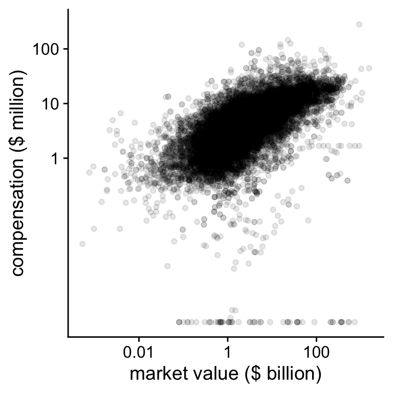 Figure 6.2: CEO compensation and firm value on the log-log scale
plot_check <-
  ggplot(data = us_comp_value,
         aes(y = total_comp, x = market_value)) +
  geom_point(alpha = .10) +
  scale_x_continuous(trans = "log",
                     breaks = scales::breaks_log(n = 5, base = 10),
                     labels = function(x) prettyNum(x/1000,
                                                    digits = 2)) +
  scale_y_continuous(trans = "log1p",
                     breaks = c(10e2, 10e3, 10e4, 10e5, 10e6),
                     labels = function(x) prettyNum(x/1000,
                                                    digits = 2)) +
  ylab("compensation ($ million)") +
  xlab("market value ($ billion)")
print(plot_check)
## Warning: Removed 2863 rows containing missing values (geom_point).On the log-log scale, we see that there are some CEOs with very low compensation compared to the bulk of the observations. In the next figure, we will just ignore those.
plot_check2 <- plot_check +
  scale_x_continuous(trans = "log", limits = c(5, NA),
               breaks = scales::log_breaks(n = 5, base = 10),
               labels = function(x) prettyNum(x/1000, digits = 2)) +
  scale_y_continuous(trans = "log1p", limits = c(5, NA),
               breaks = scales::log_breaks(n = 5, base = 10),
               labels = function(x) prettyNum(x/1000, digits = 2))
## Scale for 'x' is already present. Adding another scale for 'x', which will
## replace the existing scale.## Scale for 'y' is already present. Adding another scale for 'y', which will
## replace the existing scale.
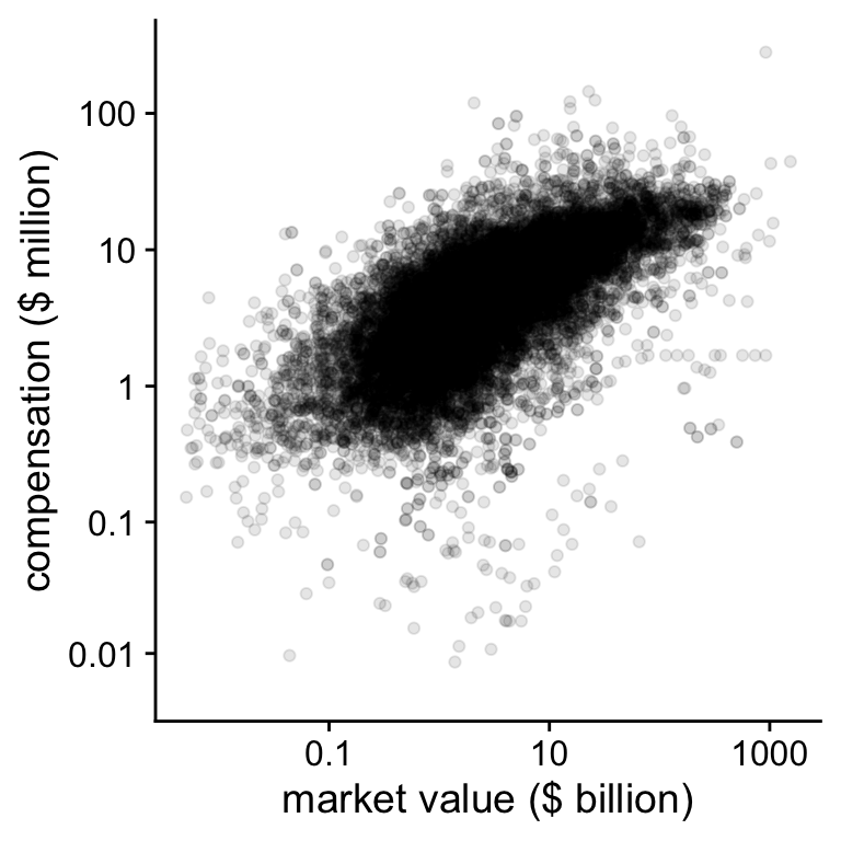 Figure 6.3: CEO compensation and firm value on the log-log scale
print(plot_check2)## Warning: Removed 2956 rows containing missing values (geom_point).Although there still a lot of variation visible, the relation
in Figure 6.3 looks reasonably linear. The
goal of plotting the data is to get an idea whether the data
reflect the explicit and implicit assumptions in your theory and
your statistical model. One of those assumptions is that the
relation between compensation and value is linear on the log-log
scale. Plotting the data also showed us that there are some CEOs
with very low or
Page built: 2022-02-01 using R version 4.1.2 (2021-11-01)