library(tidyverse)
library(here)
library(cowplot)
theme_set(theme_cowplot(font_size = 18))
i_am("generalised/introduction.qmd")
here() starts at /Users/stijnmasschelein/Library/CloudStorage/Dropbox/Teaching/lecturenotes/method_packageThe question in this section is how we should deal with outcome variables that are not continuous or restricted to be positive. I will limit the applications to the most common examples: (1) binary outcome variables and (2) positive outcome variables. Examples of binary outcome variables are the decision to disclose information, or merge a company. Positive outcome variables are variables such as employee salaries or the market value of a company.
This is a fairly contentious topic where different literature streams have different expectations and norms for what is appropriate. This is by no means a complete overview of the topic. My aim is to give you my perspective and to give you enough tools to be able to decide what is most appropriate for your research and to explain to assessors why you made those choices.
The basic problem is the following. In our typical linear model, the outcome variable can take on any value between
If we want to make sure that
You can also think of the inverse of the transformation function as transforming the outcome so that it can take all positive and negative values. This is implicitly what we have done earlier when we used the logarithmic transformation in our earlier discussion on what the appropriate measure is for pay-performance sensitivity. In the second week, we discussed the importance of theory to determine what the right measure is according to our research question. In this week, we are asking the question whether we are interested in
The discussion should also remind you of the difference between prediction and parameter estimation at the start of the machine learning chapter. The issue of the mismatch between the domain of the linear model and the outcome variable is less of an issue if we are really interested in estimating the parameter
library(tidyverse)
library(here)
library(cowplot)
theme_set(theme_cowplot(font_size = 18))
i_am("generalised/introduction.qmd")here() starts at /Users/stijnmasschelein/Library/CloudStorage/Dropbox/Teaching/lecturenotes/method_packageIn this section, I will visualise the most common transformation functions in the accounting and finance literature. I start with the logistic and probit transformations which are commonly used to model binary variables. We can think of those variables as having two values either
The logistic transformation transforms the linear scale, R has an inbuilt function plogis that does the transformation for us but you can obviously just write the transformation yourself. The code below shows that you get identical results.
N <- 1001
logit <-
  tibble(
    linear_scale = seq(from = -10, to = 10, length.out = N)) %>%
  mutate(
    logit_probability1 = exp(linear_scale)/(1 + exp(linear_scale)),
    logit_probability2 = plogis(linear_scale),
  )
glimpse(logit)
Rows: 1,001
Columns: 3
$ linear_scale <dbl> -10.00, -9.98, -9.96, -9.94, -9.92, -9.90, -9.88, -…
$ logit_probability1 <dbl> 4.539787e-05, 4.631492e-05, 4.725050e-05, 4.820498e…
$ logit_probability2 <dbl> 4.539787e-05, 4.631492e-05, 4.725050e-05, 4.820498e…ggplot(logit, aes(y = logit_probability1, x = linear_scale)) +
geom_line() +
xlab("z") + ylab("logistic(z)")![]()
In the figure, you can see how the transformed value stays between 0 and 1, exactly as we would want from a probability. Also notice how the impact of an increase of 1 on the linear scale
There is another function that is commonly used to transform the linear scale to the probability scale, the cumulative normal or probit function. We need to take a short detour to the normal distribution to explain the cumulative normal distribution to explain this function. You can see a normal distribution below where the lower 90% of the distribution is filled in yellow while the upper 10% is filled in blue. The value for
tibble(x = seq(from = -3, to = 3, length.out = N)) %>%
  mutate(dnorm = dnorm(x),
         fill = if_else(x < qnorm(0.90), "below", "above")) %>%
  ggplot(aes(y = dnorm, x = x, fill = fill)) +
  geom_area() +
  scale_fill_viridis_d() +
  ggtitle("Normal Distribution")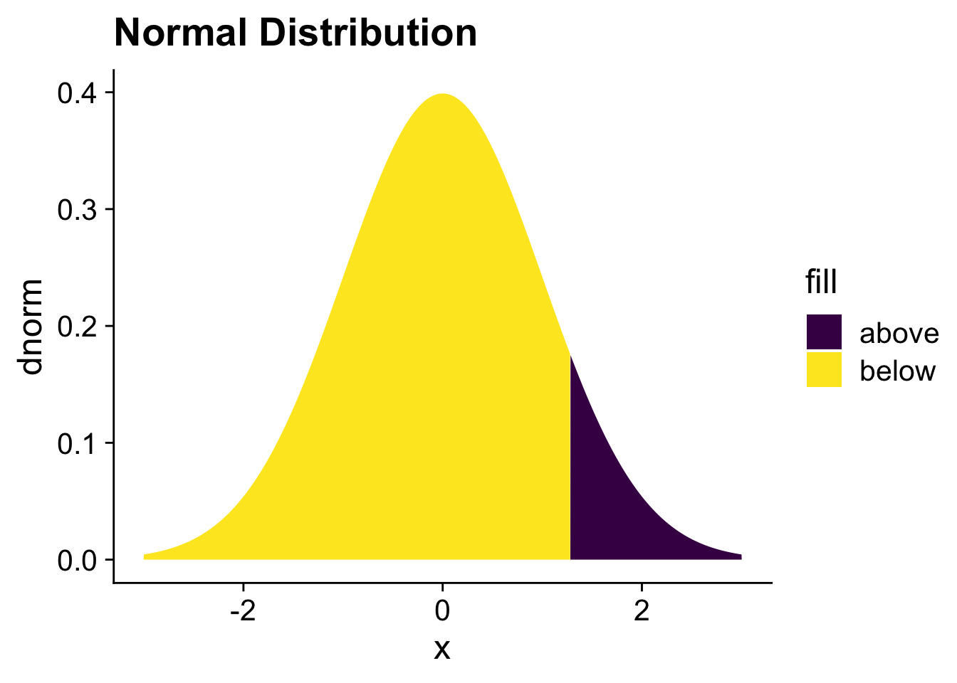
In the next code, I show the cumulative probability function for a normal distribution with mean 0 and standard deviation 1. You can see that it look quite similar to the logistic transformation. In the next, section we will compare the two transformations directly.
cumul_norm  <- logit %>%
  mutate(cumul_norm_prob = pnorm(linear_scale))
ggplot(cumul_norm, aes(y = cumul_norm_prob, x = linear_scale)) +
  geom_line() +
  xlab("z") + ylab("cumulative_normal(z)")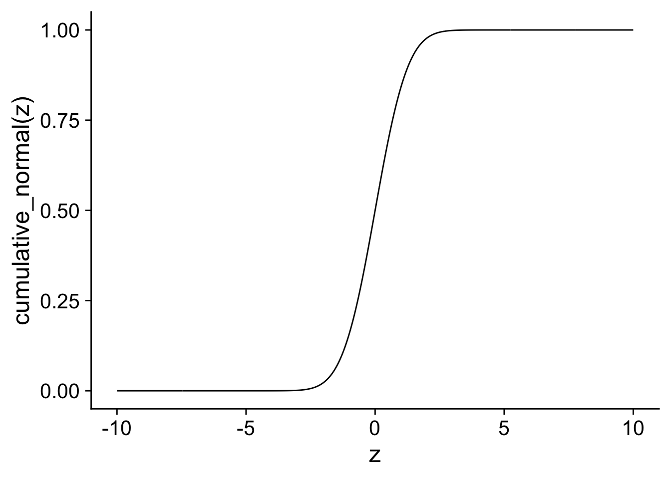
The main reason to show the comparison is to highlight that when we divide
combination <- cumul_norm %>%
  mutate(cumul_norm_adj = pnorm(linear_scale/1.6)) %>%
  select(-logit_probability2) %>%
  pivot_longer(c(logit_probability1, cumul_norm_prob, cumul_norm_adj))
ggplot(combination, aes(y = value, x = linear_scale,
                        colour = name)) +
  scale_color_viridis_d() +
  geom_line() +
  xlab("z") + xlab("g(z)") + ggtitle("Binary Distribution")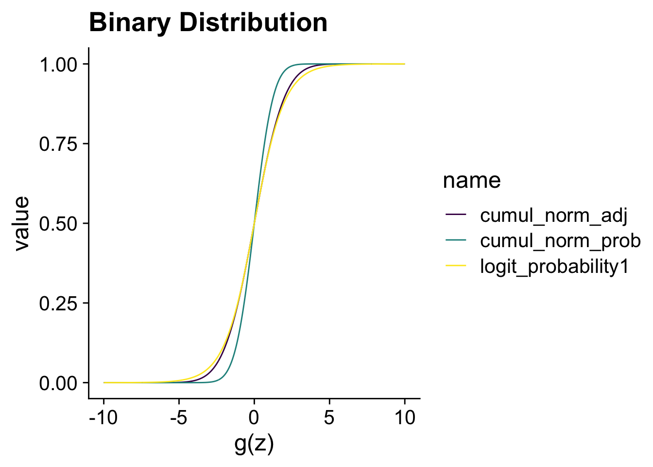
The choice between a logistic regression or a probit regression is often not consequential. If your research question requires you to model a binary variable, the choice between probit or logistic regression can be based on what the preferred choice is in your research area.
The poisson distribution (rpois) is originally developed to model the number of independent events with a fixed rate happening in a given amount of time. For instance, the number of acquisitions that a firm does in a year or the number of patents they obtained. It is the general workhorse model for any count variable. As, you can see in the figure below, you can think of the poisson distribution as discrete random distribution (the dots) around the the exponentiated linear model (the line). It will be important further on to think of a poisson regression as a model for
where
poisson <-
  tibble(linear_scale = seq(from = -3, to = 3, length.out = N)) %>%
  mutate(exp_scale = exp(linear_scale),
         poisson = rpois(N, exp_scale))
ggplot(poisson, aes(y = exp_scale, x = linear_scale)) +
  geom_line() +
  geom_point(aes(y = poisson)) +
  xlab("z") + ylab("g(z)") + ggtitle("Poisson Distribution")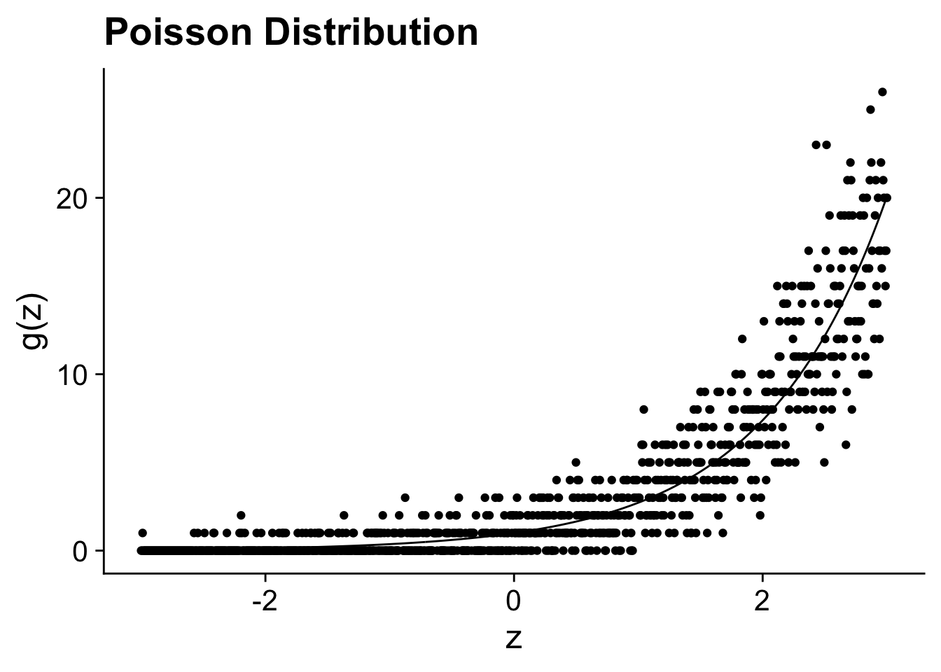
In the first lecture, I transformed a variable on the logarithm scale but that lead to problems with 0 values. I used a common hack by adding 1 to the variable and then take the logarithm. On the next page, we will see that does not always give desirable results.↩︎